UNIT 1: PHYSICAL GEOGRAPHY
| Site: | Rocky View Schools - Moodle |
| Course: | World Geography 30 Raaymakers Summer 2026 |
| Book: | UNIT 1: PHYSICAL GEOGRAPHY |
| Printed by: | Guest user |
| Date: | Thursday, 11 June 2026, 12:02 AM |
Description
Table of contents
- Introduction
- Physical and Human Geography
- The Five Themes of Geography (1/2)
- The Five Themes of Geography Continued (2/2)
- Basics: The Key Components of the Environment
- Basics: Spatial Understanding
- Basics: Types of Maps
- Basics: Geographic Tech (1/2)
- Basics: Geographic Tech (2/2)
- Project 1: Intro
- UNIT 1: MAP PROJECT INSTRUCTIONS
- How to read tables and graphs
- Bibliography Resources
Introduction
Welcome to World Geography 30!
Before we get to your first project we need to cover some of the basics of the discipline of geography.
So why study geography? Please watch the following video.
Physical and Human Geography
Physical and Human Geography
There are two important sub-fields of knowledge with similar methodology that we are going to focus on throughout this course: physical geography and human geography. The following table helps to make the differences between these two types of geography more apparent. This table describes some of the phenomena or elements studied by each of these sub-fields of knowledge. Knowing what kinds of things are studied by geographers provides us with a better understanding of the differences between physical and human geography.
Physical Geography |
Human Geography |
Rocks and Minerals |
Population |
Landforms |
Settlements |
Soils |
Economic Activities |
Animals |
Transportation |
Plants |
Recreational Activities |
Water |
Religion |
Atmosphere |
Political Systems |
Rivers and Other Water Bodies |
Social Traditions |
Environment |
Human Migration |
Climate and Weather |
Agricultural Systems |
Oceans |
Urban Systems |
The Five Themes of Geography (1/2)
If this is your first geography course, you will definitely need some
foundation knowledge of geography to help you interpret maps, photos, and other
information pertaining to the terms and concepts you we will be
exploring through your projects.
Let's start with the the five themes of geography:
Location
Location is defined as a particular place or position. Most studies of geography begin with the mention of this theme of geography. Location can be of two types: absolute location and relative location. In the former case, the location of a place is defined by its latitude and longitude or its exact address. Let us consider the case of Montreal, a city in Quebec, Canada. The coordinates 45°30′N 73°34′W define the absolute location of Montreal. However, when we say that Montreal is at a distance of approximately 540 km from Toronto, we are mentioning the relative location of Montreal. In another example, when we say that the address of the Natural History Museum of London is Cromwell Road London, SW7 5BD, United Kingdom, we are referring to its absolute location. However, we are mentioning its relative location when saying that the Natural History Museum is at a distance of about 5 km from another major tourist attraction of London, the London Eye.
Place
Place refers to the physical and human aspects of a location. This theme of geography is associated with toponym (the name of a place), site (the description of the features of the place), and situation (the environmental conditions of the place). Each place in the world has its unique characteristics. The landforms, hydrology, biogeography, soils, etc..., of each place, is different, and so are its patterns of human habitation. The human characteristics of place are defined by the nature and size of its human population, the distinct human cultures and their ways of life. The concept of “place” aids geographers to compare and contrast two places on Earth. For example, it helps to distinguish Antarctica from the Sahara Desert. One is a cold desert while the other is a hot one. While Antarctica has research stations and penguins, the Sahara has nomadic tribes and camels. The “place” theme of geography thus elaborates a clear picture of a place in our minds.
Human-Environment Interaction
No other species that has lived on our planet, as per our knowledge to this date, has such a profound effect on the environment as humans. Humans have adapted to the environment in ways that have allowed them to dominate all other species on Earth. Humans have also achieved what no other species have been capable of doing (at least to such a radical extent): modifying the planet to attain their goals of living. Thus, human-environment interaction needs special emphasis and has been classified as one of the five themes of geography. It involves three distinct aspects, dependency, adaptation, and modification. Dependency explores the ways in which humans are dependent on nature for a living. For example, in India, farmers across the country wait for the monsoons to arrive for the successful growth of their rain-fed crops. If monsoons are late, or the rains are insufficient, droughts and food crisis might create havoc in the highly populated country. Adaptation relates to how humans modify themselves, their lifestyles and their behavior to live in a new environment with new challenges. The different types of clothing invented by humans is one of the finest examples of how humans adapted to varying environmental conditions since the early days. While people in the cold countries adorned wool and fur clothing, those in the warmer countries adhered to cotton. The third aspect of the human-environment interaction and the most important one that allowed humans to “conquer” the world is the modification of the environment for his comfortable living. Humans built dams to water their fields in the dry season. They invented air coolers and air heaters to modify the air temperatures of the environment they inhabited. Humans also tamed the wild animals for their use, converted large tracts of dense forests to human-dominated settlements, and developed automobiles and airplanes that shortened distances between places. It is this final aspect of the human-environment interaction, the modification of the environment, that has also created huge problems in the earth today. Global warming and climate change, mass extinctions of wild species, high levels of environmental pollution, etc., have all resulted from the drastic environmental modifications triggered by the human race.
The Five Themes of Geography Continued (2/2)
Movement
The Earth is full of movement and in a human-dominated planet, movement primarily refers to the translocation of human beings, their goods, and their ideas from one end of the planet to another. Thus, the theme of movement becomes an important part of geographical studies. Movement deals with studies of population immigration, emigration, and distribution in the countries of the world. It is this physical movement of people that has allowed the human race to inhabit all the continents and islands of the world and also explore the depths of the oceans and land on the moon. Another aspect of movement is the transport of goods from one place on the Earth to another. In other words, it is the study of human trade, a practice that has shaped human civilizations and cultures since the time the first Homo sapiens emerged. The third and an extremely vital aspect of the movement theme is the movement of ideas. It is this interchange of ideas between the nations of the world that allows the unification of the human civilization and promotes its growth and prosperity. Thus, the theme of movement forms an integral part of geographical studies.
Region
An area on the planet that is composed of places with a unifying characteristic is a region, one of the five themes of geography. A region is defined by its uniform physical or human characteristics. A region whose boundaries are formally defined is known as a formal region. For example, metropolitan cities, districts, provinces, countries, and continents can be regarded as a formal region that is unified by a common political entity. A functional region usually encompasses a central point with defined boundaries and the area around it that is connected via a well-developed network of transportation and communication systems that facilitates the movement of people, goods, and ideas within that system. A large metropolitan city including its suburbs like the New York City in the United States, Mumbai in India, Tokyo in Japan, or Beijing in China, can be regarded as functional regions. The third type of region is vernacular region. When closely placed in the world have unifying characteristics, we tend to imagine these places bound by an “imaginary border.” Thus, though physical maps do not formally define the boundaries of such regions, we tend to create “mental maps” of such regions.For example, we often group the countries in the Arabian Peninsula as the “Middle-East region”, though such a region is never mentioned in the physical maps of the world.
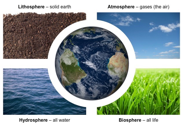
Basics: The Key Components of the Environment
The word environment means the surroundings and comes from the french word "environ," meaning around. Thus the environment is all external things that may in any way affect an organism or an object.
The global environment is an all inclusive, interacting and interdependent system. A change to any part of this system could affect some other parts of the system. No event takes place in isolation and all events have effects on the environment. Humans are an integral part of the environment and all actions we take can have effects on other parts of the system.
The global environment has four components
- the lithosphere - the soils and rocks of the uppermost mantle of the Earth
- the hydrosphere - all the water in the world - liquid, solid and gaseous
- the atmosphere - the region of gases extending above the Earth's surface
- the biosphere.- the part of the planet within which all life is found
The interaction of the four spheres is dynamic and constant.
An ecosystem is a biological community (ie plants and animals) or system formed by the interaction of things in a particular environment with one another and their habitat.
Basics: Spatial Understanding
Geography is about spatial understanding, which requires an accurate grid system to determine absolute and relative location. Absolute location is the exact x- and y- coordinate on the Earth. Relative location is the location of something relative to other entities. For example, when you use your GPS in your smart phone or car, say Google Maps, you put in an absolute location. But as you start driving, the device tells you to turn right or left relative to objects on the ground: "Turn left on exit 202"is relative to the other exit points. If you give directions to your house, you often use relative locations to help them understand how to get to your house.
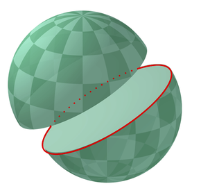 Great and Small Circles
Much of Earth's grid system is based on the location of the North Pole, South Pole, and Equator. The poles are an imaginary line running from the axis of Earth's rotation. The plane of the equator is an imaginary horizontal line that cuts the earth into two equal halves. This brings up the topic of great and small circles. A great circle is any circle that divides the earth into a circumference of two equal halves. It's also the largest circle that can be drawn on a sphere. The line connecting any points along a great circle is also the shortest distance between those two points. Examples of great circles include the Equator, all lines of longitude, the line that divides the earth into day and night called the circle of illumination , and the plane of ecliptic, which divides the earth into equal halves along the equator. Small circles are circles that cut the earth, but not into equal halves. Examples of small circles include all lines of latitude except the equator, the Tropical of Cancer, Tropic of Capricorn, the Arctic Circle, and Antarctic Circle.
Latitude and Longitude
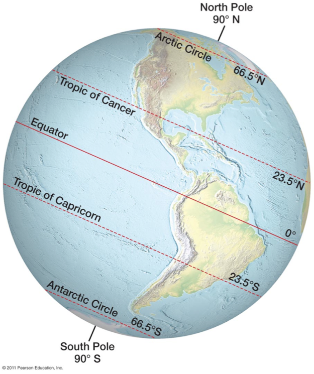
Many think that latitude is a line connecting points on the earth and it's not. Latitude is actually an angular measurement north or south of the equator. So 30 degrees north means a point that is 30 degrees north of the equator. Latitude is also expressed in degrees, minutes, and seconds; 360 degrees in a circle, 60 minutes ( ' ) in a degree, and 60 seconds ( " ) in a minute. When you use Google Earth, the coordinate locations are in this degrees/minutes/seconds format. Latitude varies from 0 degrees (equator) to 90 degrees north and south (the poles).
A line connecting all points of the same latitude is called a parallel, because the lines run parallel to each other. The only parallel that is also a great circle is the equator. All other parallels are small circles. The
following are the most important parallel lines:
-
Equator, 0 degrees
-
Tropic of Cancer, 23.5 degrees N
-
Tropic of Capricorn, 23.5 degrees S
-
Arctic Circle, 66.5 degrees N
-
Antarctic Circle, 66.5 degrees S
-
North Pole, 90 degrees N (infinitely small circle)
-
South Pole, 90 degrees S (infinitely small circle)
Latitude is also sometimes described as zones of latitude. Some of these zones of latitude include:
-
Low latitude - generally between the equator and 30 degrees N
-
Midlatitude - between 30 degrees and 60 degrees N and S
-
High latitude - latitudes greater than about 60 degrees N and S
-
Equatorial - within a few degrees of the equator
-
Tropical - within the tropics (between 23.5 degrees N and 23.5 degrees S
-
Subtropical - slightly pole-ward of the tropics, generally around 25-30 degrees N and S
-
Polar - within a few degrees of the North or South Pole
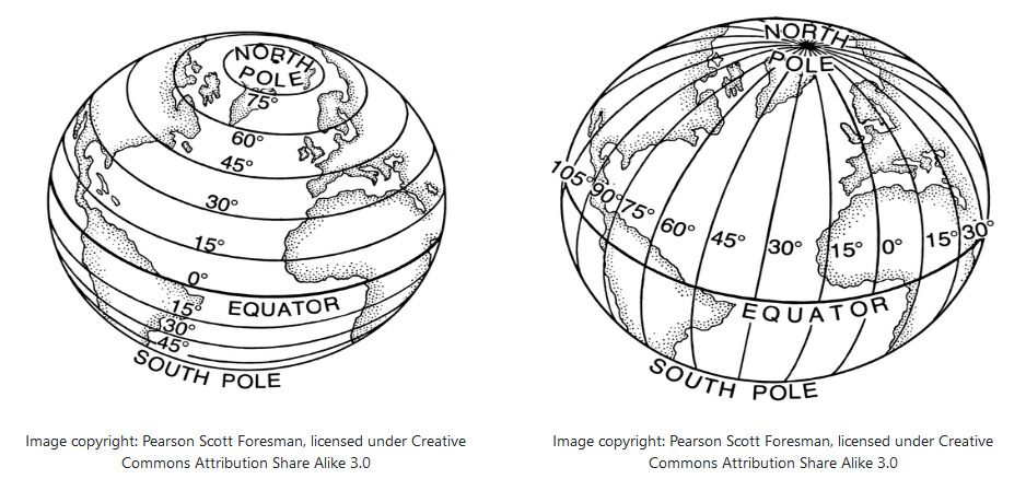
Longitude is the angular measurement east and west of the Prime Meridian (image on the right). Like latitude, longitude is measured in degrees, minutes, and seconds. Lines connecting equal points of longitude are called meridians. But unlike parallels, meridians do not run parallel to each other. Rather they are farthest apart from each other at the equator and merge toward each other toward the poles. The problem with longitude is that there isn't a natural baseline like the equator is for latitude. For over a hundred years, nations used their own "prime meridian" which proved problematic for trade. But in 1883 an international conference in Washington D.C. was held to determine a global prime meridian. After weeks of debate, the Royal Observatory at Greenwich, England was determined as the Greenwich Meridian or also called the prime meridian for the world. So today, longitude starts at the Prime Meridian and measures east and west of that line.
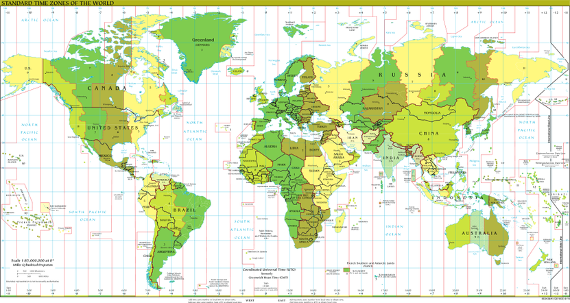
At 180 degrees of the Prime Meridian in the Pacific Ocean is the International Date Line. The line determines where the new day begins in the world. Now because of this, the International Date Line is not actually a straight line, rather it follows national borders so that a country isn't divided into two separate days (and we think hour time zones are a pain). If you look at the map above, the International Date Line is to the right in a dark, black line. Note how it is drawn to make sure nations are not divided by the International Date Line.
Contour and Gradients
A contour line on a map is a line that joins points of equal elevation.
Watch the video below to understand how this concept works on a natural landscape.
Gradient is a measurement of the steepness of the land or simply slope.
Formula:
Basics: Types of Maps
Millions of unique maps are in use throughout the world. Most of these maps can be placed into one of two groups: 1) reference maps; and, 2) thematic maps.
- Reference maps show the location of geographic boundaries, physical features of Earth, or cultural features such as places, cities, and roads. Political maps, physical maps, road maps, topographic maps, time zone maps, geologic maps, and zip code maps are all examples of reference maps. A variety of reference maps have been created for almost every country of the world.
- Thematic maps show the variation of a topic (the theme) across a geographic area. Weather maps showing daily high temperatures across Alberta are familiar examples of a thematic map. They are made by starting with a reference map of the Alberta. Then temperature data is plotted atop of the reference map using colors to communicate the temperature forecast. Income maps and resource maps are other types of thematic maps.
People have been making maps for thousands of years. The first map might have been a sketch made in sand using a stick or a finger. It might have been charcoal marks on a stone, or engravings on a clay tablet. Eventually maps were drawn on paper. The printing press enabled those maps to be printed on paper and distributed by the thousands.
Papermaking and printing eventually became inexpensive enough that almost anyone could afford to purchase a map, and until the late 1960s, many gasoline stations were still distributing free road maps as an advertising courtesy to their customers.
In the 1990s the internet enabled the distribution of maps online, and the economics of map distribution (and the ability to sell certain types of maps) were changed forever. Soon, with interactive map serving, any user of the internet could become a cartographer. Now more unique maps are produced online every day than were made in across the entire history of mapmaking, from pre-history until about 1992.
Some Basic Examples:
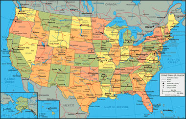 Political Maps are among the most widely used reference maps. They
are mounted on the walls of classrooms throughout the world. They show
the geographic boundaries between governmental units such as countries,
states, and counties. They show roads, cities and major water features
such as oceans, rivers and lakes.
Political Maps are among the most widely used reference maps. They
are mounted on the walls of classrooms throughout the world. They show
the geographic boundaries between governmental units such as countries,
states, and counties. They show roads, cities and major water features
such as oceans, rivers and lakes.
Political maps help people understand the geography of the world. They are usually the first type of map that students are introduced to in school. They are also known as “reference maps” because people refer to them again and again as they have questions.
Thousands of different political reference maps have been prepared to show the current geography of the United States. There are maps of the entire nation, maps for each of the 50 states, maps of the 3142 counties (parishes in Louisiana, and boroughs in Alaska) that make up the states. Most counties, boroughs and parishes are further subdivided into even smaller political units. An incredible number of political maps have been prepared just to display the geography of the United States.
The maps most commonly seen in classrooms and offices are political maps of the world, countries and continents. They are often annotated with push pins, sticky notes, photographs, marker flags and string to show the travels of a family, locations of a business, or other locations and activities worthy of display.
 Physical maps are designed to show the natural landscape features of
Earth. They are best known for showing topography, either by colors or
as shaded relief. Physical maps often have a green to brown to gray
color scheme for showing the elevation of the land. Darker greens are
used for near-sea-level elevations, with the color grading into tans and
browns as elevations increase. The color gradient often terminates in
shades of gray for the highest elevations.
Physical maps are designed to show the natural landscape features of
Earth. They are best known for showing topography, either by colors or
as shaded relief. Physical maps often have a green to brown to gray
color scheme for showing the elevation of the land. Darker greens are
used for near-sea-level elevations, with the color grading into tans and
browns as elevations increase. The color gradient often terminates in
shades of gray for the highest elevations.
Rivers, lakes, seas and oceans are usually shown in blue, often with a light blue color for the most shallow areas and darkening in a gradient or by intervals for areas of deeper water. Glaciers and ice caps are shown in white colors.
Physical maps usually show the most important political boundaries, such as state and country boundaries. Major cities and major roads are often shown. This cultural information is not the focus of a physical map, but it is often included for geographic reference and to increase the utility of the map for many users.
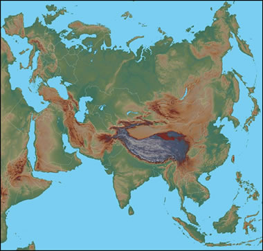
This physical map of Eurasia shows the topography of the land in a color-gradient relief. Dark greens are used for near-sea-level elevations, and the green grades to tan and brown as elevation increases. The highest elevations are shown in shades of gray. If you are familiar with the physical features of Eurasia, you can probably recognize the Himalaya Mountain Range, the Tibetan Plateau, the Alps, and the more subtle Ural Mountains. Lake Baikal, the world's largest freshwater lake by volume, can be seen in central Asia.
 Topographic maps are reference maps that show the shape of Earth’s
surface. They usually do this with lines of equal elevation known as
“contour lines”, but elevation can also be shown using colors (second map), color gradients, shaded relief and a number of other methods.
Topographic maps are reference maps that show the shape of Earth’s
surface. They usually do this with lines of equal elevation known as
“contour lines”, but elevation can also be shown using colors (second map), color gradients, shaded relief and a number of other methods.
Topographic maps are frequently used by hunters, hikers, skiers, and others seeking outdoor recreation. They are also essential tools of the trade for geologists, surveyors, engineers, construction workers, landscape planners, architects, biologists and many other professions - especially people in the military.
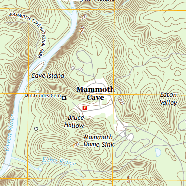
Topographic maps also show other important natural features such as lakes, rivers and streams. Their locations are determined by topography, making them important natural elements of topographic maps.The map to the right featuring Mammoth Cave National Park in Kentucky shows Earth's topography using brown contour lines with a contour interval of 20 feet. Roads, place names, streams and other features are also shown. Areas on the map where the brown contour lines are close together have steep slopes. Areas where the contour lines are spaced far apart have gentler slopes.
Important cultural features are also shown on topographic maps. These include roads, trails, buildings, place names, bench marks, cemeteries, churches, schools and much more. A standardized set of special symbols has been developed for this use.
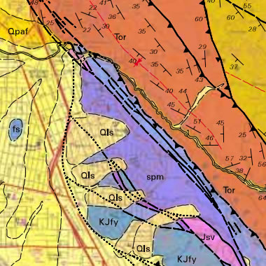 Geologic maps show the types of rocks
and sediments present immediately below the surface of a geographic
area. Sediment cover is shown in shades of yellow, and rock units are
shown in a variety of colors, often based upon their lithology. Rock
unit contacts, faults, folds, and strike and dip measurements are
plotted in black.
Geologic maps show the types of rocks
and sediments present immediately below the surface of a geographic
area. Sediment cover is shown in shades of yellow, and rock units are
shown in a variety of colors, often based upon their lithology. Rock
unit contacts, faults, folds, and strike and dip measurements are
plotted in black.
Geologic maps are important data sources for many types of work. Certain types of rock are used for construction materials, and a geologic map shows where they are located at the surface. Other types of rock might contain valuable minerals, and a geologic map can be used as a preliminary tool for deciding where to drill or prospect.
Areas near volcanoes might be underlain by lava flows, lahar deposits, pyroclastic flows or other volcanic products. Geologic maps can be used to conduct a preliminary volcanic hazard assessment of an area. Most geologic maps are usually accompanied by at least one cross-section that illustrates what is expected to be seen if a “slice through the Earth” was cut across the map area. These cross-sections illustrate the geologic structures inferred by mapping the rocks and sediments above.
People use an incredible number of weather maps. They are used to show predicted temperatures, predicted precipitation, storm warnings of various kinds, wind speed and direction, chance of precipitation, type of precipitation, snow accumulation, frost prediction and many other aspects of weather.
All of these weather maps are continuously updated to communicate the most current information. They are the world's most frequently consulted thematic maps. Weather maps are presented in newspapers, television programs and especially on websites. Delivering weather maps on websites and through web apps gives people around the world instant access to weather information.
Many weather maps are animated maps that show historical or projected changes in the weather. These are extremely useful for people who need to know how changes in weather will impact their travel, workday, recreation, and many other plans.
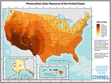 Resource maps are incredibly important to a lot of different fields of study. Resource maps are a type of thematic map where the aim is to communicate the geographic distribution of natural resources. These maps might show countries with the highest diamond production or the geographic extent of an oil or gas field. The map shown here illustrates the geographic pattern of solar generating capacity for the United States.
Resource maps are important because they help governments understand their natural resource assets and the natural resource assets of their allies and potential enemies. Resource maps help mining companies target their exploration efforts. They are also important for assessing the transportation opportunities and problems associated with the distribution of resources and the location of where they are consumed.
Basics: Geographic Tech (1/2)
What Is Aerial Photography and How Does It Work?
Aerial
photography is - as it sounds - the process of taking photographs from
the air, but there is more to it than simply using a light aircraft or
helicopter and flying up to take photographs. There are many elements to
an aerial survey that must be considered to ensure that the data is
useful enough to extrapolate whatever is being investigated. It is often
difficult to see elements of the landscape on the ground, features can
easily be missed, and what might seem like an insignificant bump from
ground level can become more significant in a wider context ; some
landscape types are difficult to access on foot so aerial photographs
are vital to study and map them.
They have been used as a method
of landscape studies for over a century, especially in archaeology and
researchers have learnt much about the world around us; its applications
today are broad and coupled with the growing technology of GIS
(geographic information systems), the potential means that the method
will not become obsolete any time soon. Aerial photographs are taken in
two basic forms and both have different uses and applications: oblique
and vertical. Even today in an age of high quality digital imaging,
black and white images are preferred - partly because they are cheaper
but also partly because the contrast of black, white and greys makes it
easier to pick out features.
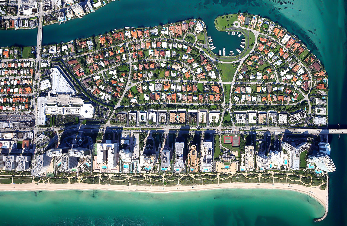
Look at the image below, of a
greenway in Boston, USA. See which features you can make out. Think
about which other features this image would not prove useful for.
Oblique
These images, such as the one above, are usually
taken at an angle, typically 45 degrees but as they are often taken
manually, they can be whatever angle gives the best view of the feature
or landscape. The oblique image is primarily used in archaeology to take
a wider context of a feature and the area around it, and also to give
depth. Nearly always taken at a much lower elevation than the vertical
image and in few numbers, its application is fairly limited and often
taken for a specific purpose. There is a problem in perspective because
the farther away a feature is, the smaller it will appear: nearer
objects of comparable size appear larger than those that are farther
away so it is often best to take a selection or to use a frame of
reference on the ground for perspective purposes. These images are taken
from small fixed-wing aircraft and helicopters and are perfectly suited
for monitoring erosion of features and monuments throughout the year
and over the course of many decades.
Taking a photograph straight down over a landscape is the more familiar
form of aerial photograph. It is a plan view so there is no perspective
to distort the image. This also means that it is difficult to read the
lay of the land such as changes in height - though there is a work
around to create 3D image through stereoscopic views, using a device to
examine two at once. This usually gives a good impression of the
variation in the elevation of land . They are taken at regular heights
for consistency so it is easier to compare contexts of a landscape taken
on the same day, or many years apart to examine development. Rarely
used in archaeological applications except perhaps sometimes to find
interesting earthworks and other sites that are easily missed on the
ground, they cover a much wider area and focus on topography rather than
specific details.
Basics: Geographic Tech (2/2)
The digital mapping revolution caused an explosion of map creation in the 1990s. In 1996, MapQuest, the first popular online mapping service, allowed anyone with internet access the ability to create customized maps of almost any location in the United States. Within a few months, millions of people had become “cartographers”. They were soon producing more unique maps in a single day than had been created during the entire history of paper cartography!
GPS
For thousands of years, we have used the position of the stars to
navigate. Now, using artificial "stars" (satellites), we can navigate
using computers and the Global Positioning System. The GPS system is based on a network of satellites that send out
signals along the radio frequency. This system provides accurate
positions no matter the weather, time of day or location. As long as a
GPS unit can get a proper signal, the position can be determined. These satellites orbit the earth twice a day at very high altitude. A
user with a GPS receiver needs at least four satellites above the
horizon in order to able to computer his position. Each of these
satellites will tell the receiver how far the satellite is away and the
satellite's exact position in space. The GPS receiver now does some
fancy math to figure out absolute position, usually in latitude and
longitude. GPS receivers can theoretically be accurate down to centimeters, but usually they are not this accurate due to various errors.
Once just used for science, GPS units have become affordable enough
that they are used by emergency services, utilities and your average car
driver. Geographers use GPS to accurately record the position of an
area of interest and in remote sensing.
GIS
A geographic information system (GIS) is a computer system for
capturing, storing, checking, and displaying data related to positions
on Earth’s surface. By relating seemingly unrelated data, GIS can help
individuals and organizations better understand spatial patterns and
relationships.
GIS technology is a crucial part of spatial data
infrastructure, which may be defined as “the technology, policies,
standards, human resources, and related activities necessary to acquire,
process, distribute, use, maintain, and preserve spatial data.”
GIS can use any information that includes location. The location can be
expressed in many different ways, such as latitude and longitude,
address, or postal code.
Many different types of information
can be compared and contrasted using GIS. The system can include data
about people, such as population, income, or education level. It can
include information about the landscape, such as the location of
streams, different kinds of vegetation, and different kinds of soil. It
can include information about the sites of factories, farms, and
schools; or storm drains, roads, and electric power lines.
With
GIS technology, people can compare the locations of different things in
order to discover how they relate to each other. For example, using GIS,
a single map could include sites that produce pollution, such as
factories, and sites that are sensitive to pollution, such as wetlands
and rivers. Such a map would help people determine where water supplies
are most at risk.
Data Capture
Putting information into GIS is
called data capture. Data that are already in digital form, such as
most tables and images taken by satellites, can simply be uploaded into
GIS. Maps, however, must first be scanned, or converted to digital
format.
GIS applications include both hardware and
software systems. These applications may include cartographic data,
photographic data, digital data, or data in spreadsheets. Cartographic
data are already in map form, and may include such information as the
location of rivers, roads, hills, and valleys. Cartographic data may
also include survey data, mapping information which can be directly
entered into a GIS. Additionally, photographic interpretation is a major part
of GIS. Photo interpretation involves analyzing aerial photographs and
assessing the features that appear. Digital data can also be
entered into GIS. An example of this kind of information is computer
data collected by satellites that show land use—the location of farms,
towns, and forests.
Finally,
GIS can also include data in table or spreadsheet form, such as
population demographics. Demographics can range from age, income, and
ethnicity to recent purchases and Internet browsing preferences. GIS
technology allows all these different types of information, no matter
their source or original format, to be overlaid on top of one another on
a single map. GIS uses location as the key index variable to relate
these seemingly unrelated data.
Spatial Relationships
GIS technology can
be used to display spatial relationships and linear networks. Spatial
relationships may display topography, such as agricultural fields and
streams. They may also display land-use patterns, such as the location
of parks and housing complexes.
Linear networks, sometimes
called geometric networks, are often represented by roads, rivers, and
public utility grids in a GIS. A line on a map may indicate a road or
highway. With GIS layers, however, that road may indicate the boundary
of a school district, public park, or other demographic or land-use
area. Using diverse data capture, the linear network of a river may be
mapped on a GIS to indicate the stream flow of different tributaries. GIS
must make the information from all the various maps and sources align,
so they fit together on the same scale. A scale is the relationship
between the distance on a map and the actual distance on Earth.
Often,
GIS must manipulate data because different maps have different
projections. A projection is the method of transferring information from
Earth’s curved surface to a flat piece of paper or computer screen.
Different types of projections accomplish this task in different ways,
but all result in some distortion. To transfer a curved,
three-dimensional shape onto a flat surface inevitably requires
stretching some parts and squeezing others. A world map can
show either the correct sizes of countries or their correct shapes, but
it can’t do both. GIS takes data from maps that were made using
different projections and combines them so all the information can be
displayed using one common projection.
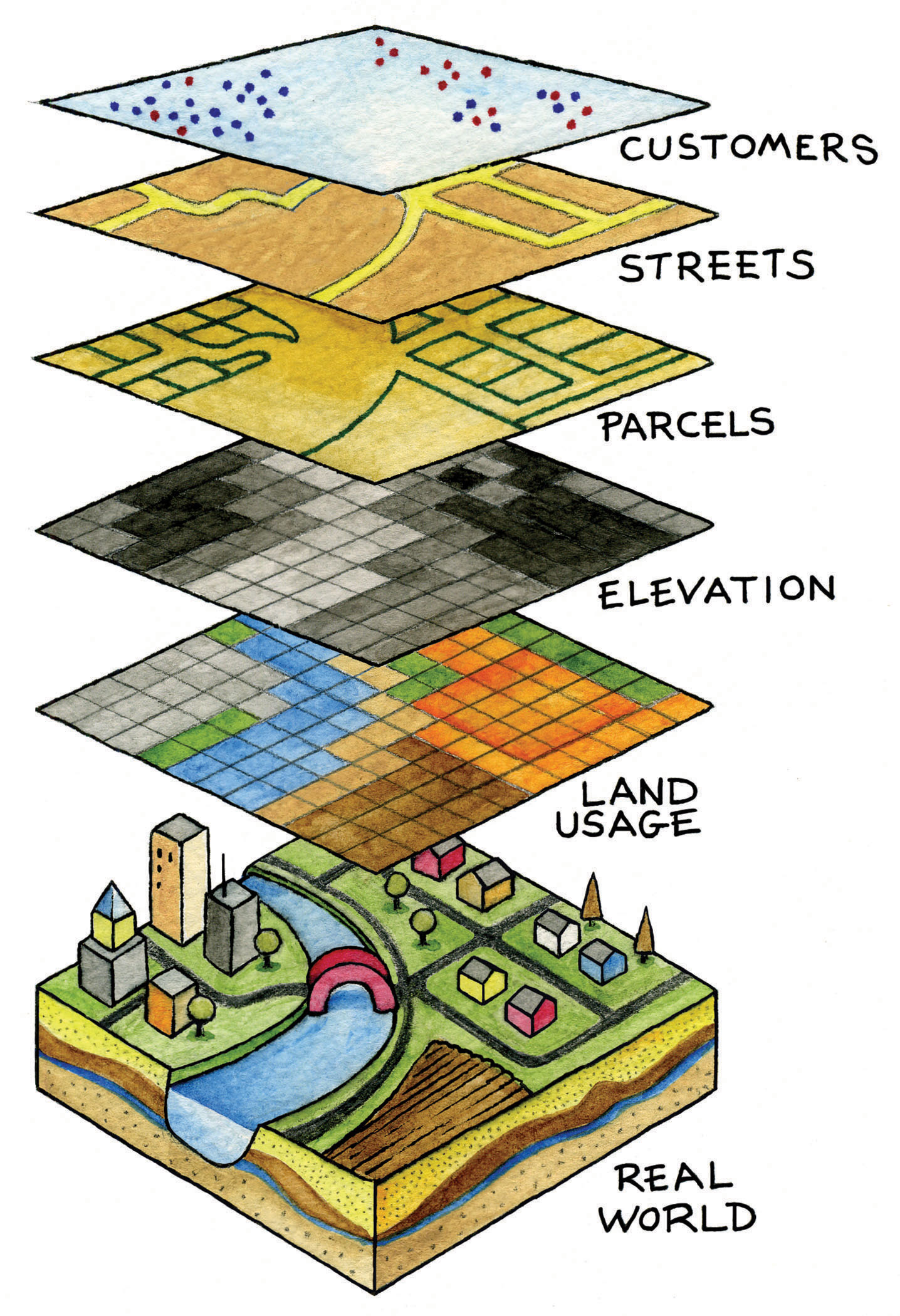
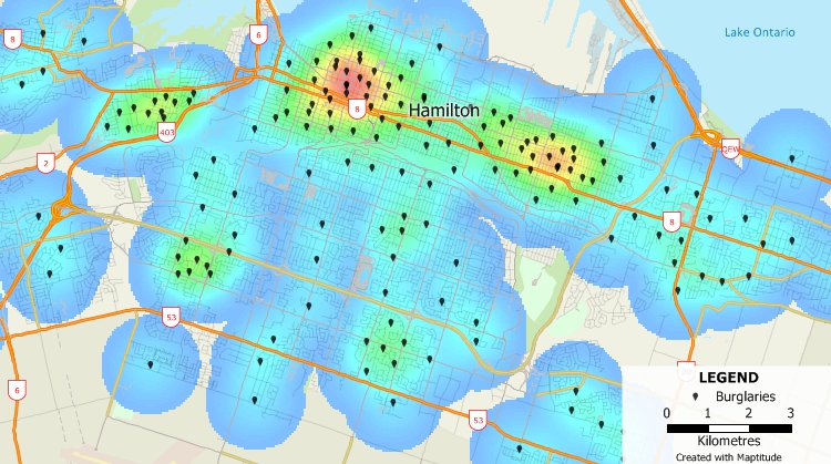
Once all of the desired data have been entered into a GIS system, they can be combined to produce a wide variety of individual maps, depending on which data layers are included. One of the most common uses of GIS technology involves comparing natural features with human activity. Below is a GIS map of Hamilton, Ontario that has been used to visualize crime hot-spots such as burglaries.
GIS maps can display what manmade features are near
certain natural features, such as which homes and businesses are in
areas prone to flooding. It also allows to “dig
deep” in a specific area with many kinds of information. Maps of a
single city or neighborhood can relate such information as average
income, book sales, or voting patterns. Any GIS data layer can be added
or subtracted to the same map. As well, GIS maps can be used to show
information about numbers and density. For example, GIS can show how
many doctors there are in a neighborhood compared with the area’s
population. With GIS technology, researchers can also look at
change over time. They can use satellite data to study topics such as
the advance and retreat of ice cover in polar regions, and how that
coverage has changed through time. A police precinct might study changes
in crime data to help determine where to assign officers.
One
important use of time-based GIS technology involves creating time-lapse
photography that shows processes occurring over large areas and long
periods of time. For example, data showing the movement of fluid in
ocean or air currents help scientists better understand how moisture and
heat energy move around the globe. GIS technology sometimes
allows users to access further information about specific areas on a
map. A person can point to a spot on a digital map to find other
information stored in the GIS about that location. For example, a user
might click on a school to find how many students are enrolled, how many
students there are per teacher, or what sports facilities the school
has. GIS systems are often used to produce three-dimensional
images. This is useful, for example, to geologists studying earthquake
faults.
GIS technology makes updating maps much easier than
updating maps created manually. Updated data can simply be added to the
existing GIS program. A new map can then be printed or displayed on
screen. This skips the traditional process of drawing a map, which can
be time-consuming and expensive.
Project 1: Intro
Project 1
Welcome
to the first project! As this is mostly a project-based course, you
will do the majority of the required learning of all of the major
concepts through, well, your own work. If you need me to explain
concepts or help you find resources, I am glad too! Ensure that your bibliographies
are robust and filled with excellent scientific references. If you need a
tutorial on how to research well, let me know! I am always happy to
help!
A good place to start would be to review the following document: How to Conduct Research on the Internet.
The Purpose of the First Project.
This self-guided research project will have you explore the first theme of the course: world patterns of physical elements. You, the budding geographer, will demonstrate an understanding of the following:
a. the lithosphere
b. landforms
c. climate: elements, controls, regions
d. vegetation; soils
To complete this short module, you will create a presentation about important terms and concepts in physical geography and explain how they impact our lives. This is a simple, yet time consuming project that requires some reliable, valid research and good scientific writing. Make sure you meet all of the requirements of the assignment!
The instructions for this assignment are found on the next page ---->
UNIT 1: MAP PROJECT INSTRUCTIONS
In a Powerpoint, essay, video, infographic, or whatever other creative endeavour you want to undertake, your task is to:
Define,
describe, and show understanding of each of the following physical
geography concepts and talk about how they impact human activity on the
planet:
- the lithosphere
- landforms
- climate: (a)elements, (b)controls, (c)regions
- vegetation
- soils
You MUST include the following in your project:
- a scientific definition of EVERY concept/term mentioned above (in your own words) and a detailed discussion of what the significance of said term is.
- a map representing/expressing each of the terms above accompanied by an explanation of the map, and
- a detailed explanation of how EACH of the above concepts impact/influence human activity.
- CHOICE OF MAPS: /10
- MAPS DISCUSSION (make sure you address human impact): /30
- BIBLIOGRAPHY in APA or MLA format: /10
- TOTAL: /50
How to read tables and graphs
Does the quotation above apply to you? Most of us can make better sense of numbers when they appear in graph form. Graphs can make trends apparent and illustrate clearly changes, differences, and inequalities. Consider some information presented in three ways: paragraph form, chart form, and graph form.
Misuse of graphics
|
||||||||
You should understand how charts and graphs can be used to mislead people.
-
Exaggerating or compressing the scale: The oldest trick is to mislead people by exaggerating or compressing the scale of the graph. The figures can show the same data, such as the death rate in women with breast cancer in England and Wales between 1951 and 1981. The first graph can suggest an alarming increase in the trend by not beginning at zero and showing the intervals as large as possible. If the second graph has a true zero on the y axis and the intervals are small, the results can look much less impressive. Researchers should use true zero if possible.
-
No scale provided: This is used very commonly by drug companies to push their drugs in the market. Neat trends are shown to demonstrate the beneficial effects of a drug without any scale! One must always be careful while interpreting graphs and charts that do not have scales. Also, be wary when a scale is given but no units are mentioned!
-
The graph based on insufficient data: Graphs with great looking trends and comparisons are drawn without any mention about the sample size. What if only ten people were tested? The trial of the drug could be made on only a handful of patients, and this fact is neatly concealed.
-
Too much data: When graphs and charts have too much information, they confuse the reader. If an overwhelming amount of information is provided, nothing is learned.
Guidelines for making good graphs
-
Before making a graph or chart, decide on the point that you wish to present, and then chose an appropriate method.
-
Emphasize one idea at a time in a figure.
-
Use conventional graphing methods.
-
Pay careful attention to the scale.
-
Construct graphs and tables that have meaningful information without reference to the text. Clear labels are essential.
-
Specify the units used.
-
Use few colours. Too many may look pretty, but they can confuse!
-
Be consistent in the use of colours and fonts in a series of graphs and tables.
Some terms to know
-
The range of the data set is the difference between the largest and smallest number in the set. To find the range, subtract the smallest number from the largest number in the set.
-
The mean of the data set is its average. To find the mean, add all the numbers and divide the answer by how many numbers you have.
-
The median is the number that is in the exact middle of the data set.
-
The mode is the number that appears the most often if you are working with only one variable.
Bibliography Resources
APA
(American Psychological Association) and MLA (Modern Language
Association) formatting are two different ways to reference and cite sources
for your research projects and assignments. You don't need to do them in a
super detailed manner, but I would like to see you attempt formatting your
citations properly throughout the course. You don't need to do in-text
citations for me but I would encourage you to try them. In-text citations are
the stuff in the brackets at the end of the sentence that point the reader to a
specific source in the reference list or bibliography.
If you are planning on going to university/college, you will need to know how to do these things. Please pick one style to use for the course.
- You will likely use APA if you are going into nursing, psych, social sciences, sometimes business, etc.
- You will likely use MLA if you are studying humanities, liberal arts stuff, sometimes business, etc.
You can see some guides and examples here (just look at the works cited/references sections):
MLA:
https://owl.english.purdue.
APA: https://owl.english.purdue.
Let me know if you have any questions about this stuff!